
The best way to use icons in Web UIs
What if I told you, you could use CSS to insert and tweak icons without touching any HTML? And that it could be more flexible and maintainable than what you’ve been using?
I’ve always had a soft spot for icons1. Not only do they add polish to a UI, they can also tangibly improve usability. Familiar icons help users find what they need quickly, since we recognize pictures much faster than we read words.
And as a web architect at heart, the current dominant ways we have to include icons on the Web make me sad. While there are many, many different ways to include icons in a Web UI, each with different performance characteristics, by far the most common ones involve adding inline SVG to the HTML. For example, a trash icon might be included like this:
<button>
<svg xmlns="http://www.w3.org/2000/svg" width="24" height="24" viewBox="0 0 24 24" fill="none" stroke="currentColor" stroke-width="2" stroke-linecap="round" stroke-linejoin="round" class="lucide lucide-trash preview-icon"><path d="M10 11v6"/><path d="M14 11v6"/><path d="M19 6v14a2 2 0 0 1-2 2H7a2 2 0 0 1-2-2V6"/><path d="M3 6h18"/><path d="M8 6V4a2 2 0 0 1 2-2h4a2 2 0 0 1 2 2v2"/></svg>
Delete
</button>
Some people use a separate SVG file for sanity and include icons via <use>, but the markup is still fairly clunky (not to mention slow, sans bundlers).
All this clunkiness forces people to resort to hiding the icon under layers of abstraction, such as dedicated custom elements like <x-icon name="trash"></x-icon> or React components like <TrashIcon />,
but the ugliness still ships under all these layers, and the browser still has to deal with it.
Icon fonts did put icons in CSS (::before { content: "\f1f8" } is still how Font Awesome’s pseudo-element mode works), and a lot of their appeal was exactly that.
But they came with a long list of issues:
large downloads (even with subsetting), fallback glyphs when the font fails to load, screen readers announcing private-use codepoints, user font overrides (e.g. for dyslexia) wiping them out, and text hinting that was never designed for pictures.
We threw out the baby with the bathwater: the problem was the font, not the CSS.
Many of the attempts to move this to CSS still involve markup. The mask trick that most of them rely on is not new either: Chen Hui Jing covered it in 2021, and Iconify generates mask-based CSS for its entire catalog. But in all of these, which icon to use (and whether to use one at all) is still decided in the markup, via one class per icon; CSS only handles color. The closest I’ve seen is David Bushell’s 2024 post on including icons purely via CSS via generated content + masks, where the icon is picked in CSS, but every selector that wants to support icons needs its own chunk of CSS, and there is no way to override the icon on a case by case basis. I still think it’s superior to inline SVG in HTML, and it baffles me why it isn’t more popular.
A user-centered icon system
Per the principles outlined in my user effort article, a good icon system should:
- keep syntax close to the minimum necessary to declare intent, and
- make simple things easy, complex things possible, and the transition from one to the other smooth (no usability cliffs)
How does that translate to an icon system?
- High signal-to-noise ratio: The intent to add or override an icon is basically “icon” plus the icon name, and possibly its location (start, end, marker, etc). Anything beyond that is boilerplate. Some boilerplate is unavoidable, but most
<svg>-based solutions involve unacceptable amounts of boilerplate (which is why we end up abstracting that away). - Simple things should be easy:
- We should be able to define default icons for certain cases without having to explicitly include them at every callsite. E.g. a
<button class="delete">should automatically get a trash icon, without needing to declare it in the markup in any way, shape, or form, unless we want to override it. - The default icon color should follow the local text color (or designated icon color, if different) without any additional song and dance.
- We should be able to define default icons for certain cases without having to explicitly include them at every callsite. E.g. a
- Complex things should be possible:
- We should be able to easily override the default icon for a component, either permanently or as a result of various conditions (state changes, user interaction, etc.).
- Styling the icon should be as easy as applying a CSS property. The minimum is color, but the more extensive styling is possible, the better.
- No usability cliffs: Overridding an icon, temporarily or permanently, should still not require much more than the bits of information necessary to declare intent.
Per consumers > producers, making icon usage ergonomic is more important than making icon definition ergonomic, but ideally adding a new icon to the icon system should not require much more than:
- declaring the name of the icon, and
- providing the SVG path data or a URL to an SVG file
And of course, it still needs to be reasonably performant — the existing success criteria don’t disappear!
The dominant ways to include icons today fail to meet at least one of these criteria. Can we do better?
Why CSS?
CSS is the only web platform language that facilitates reactive aggregation: you declare what applies to what conditions (type of element, interaction state, media query, etc.) and the browser automatically applies the right styles when those conditions are met and cleanly removes them when they are no longer met, without affecting any other conditions that simultaneously apply to the element, and without forcing developers to manage any of these side effects manually.
I personally think we are underutilizing this wonderful language by artificially restricting it to styling, but that’s a topic for another article.
If we can nail icons via CSS, this gives us tremendous expressive power, with practically no loss of flexibility.
Imagine being able to tweak icons based on…
- Any selector, including interaction pseudo-classes (
:hover,:focus, etc.), e.g. to communicate additional information about the action or adapt to a different background color - Media queries (
print, dark mode, high contrast, etc), e.g. use different icons in dark mode, add or remove them in print, etc. - Container queries
- Writing mode, e.g. to use a different icon for RTL text
Additionally, if icons can be injected or tweaked via CSS, this means we can specify them on pseudo-elements, such as details::marker, select::picker-icon, or option::checkmark, something no markup solution accommodates.
Or even, imagine applying entirely different icon sets to the entire page (or a portion) without having to touch any markup! E.g. a section with a hand-drawn aesthetic could get a hand-drawn icon set, without affecting the rest of the UI.
The possibilities are endless. Once you allow yourself to consider that this is possible, you will start seeing use cases everywhere.
Icons should be design tokens
Including icons as direct <svg>s (especially with no wrapping abstraction to manage a shared registry) means there is no way to enforce consistency — anything goes.
One page might use a Font Awesome trash icon, another might use a Lucide trash icon.
I think the icons themselves should be a type of design token, managed by the design system, that UI components simply use, just like colors and gradients.
Managing icons via CSS also allows us to define them alongside other design tokens (e.g. as CSS variables on :root), rather than in a separate place.
What does it look like?
Suppose icons were CSS variables, and we could add an icon to an element simply by setting an --icon custom property, e.g. by doing something like
<button style="--icon: var(--icon-trash)">Delete</button>
This means we could also make simple things easy via:
button.delete {
  --icon: var(--icon-trash);
}
while maintaining the ability to override the icon on a case by case basis by simply overridding the --icon property.
We can even adapt to state reactively:
button.delete {
	--icon: var(--icon-trash-outlined);
@media (prefers-color-scheme: dark) {
–icon: var(–icon-trash-filled);
}
&:hover {
background: var(–color-danger);
/* See https://lea.verou.me/blog/2024/contrast-color/
for making it adapt automatically */
color: var(–color-danger-text);
}
}
a[href^="https://"] {
@media print {
–icon-end: var(–icon-link-external);
}
}
or user interaction, e.g. to communicate both where a link goes (GitHub) and what it is (an external link):
a.github {
	--icon: var(--icon-github);
&:hover {
–icon: var(–icon-link-external);
}
}
And for completely ad hoc standalone icons where adding CSS would be more work than doing it inline in HTML, we can have an .icon class:
<i class="icon" style="--icon: var(--icon-trash)"></i>
This makes it strictly more powerful than the markup approaches, with the only exception being that completely inline SVG allows potentially changing the SVG itself in arbitrary ways (e.g. morphing it into another icon or changing it dynamically as the result of user input). For those cases, we’d still need inline SVGs. But how many of your icons fall in that category?
How it works
The core idea can be summarized as:
- Icons are first-class design tokens stored in
--icon-[name]properties that hold<image>values (embedded or remote) - Icons are inserted via pseudo-elements.
- The icon is applied as a mask to a square with
backgroundequal to the icon color. - The system uses general CSS custom properties like
--icon,--icon-start, and--icon-endfor flexibility and reusability. - Style queries +
@propertyfor conditional icon insertion based on these custom properties.
Rendering and referencing icons
Icons are inserted via pseudo-elements, which use the icon to mask a square with background equal to the icon color.
The referencing syntax I’ve settled on is:
- Low-level
--icon-[location]properties:--icon-startto prepend an icon to element contents (via::before)--icon-endto append an icon to element contents (via::after)- Optionally, additional properties can redirect to other pseudo-elements, e.g.
--icon-markerfor::marker
--iconhigher level abstraction that just means “add an icon to this component”: components2 can redirect it to any of the lower-level--icon-[location]properties on the element itself or a descendant depending on what makes sense for that component. E.g.--iconmay set--icon-starton a<button>but--icon-markeron<summary>
You could be more elaborate and also define --icon-[state] properties like --icon-hover, --icon-focus etc, if you deem them useful!
The beauty of this approach is its immense flexibility.
Available icons are defined on :root as CSS variables, e.g.:
:root {
	/* Embedded, for performance */
	--icon-trash: url("data:image/svg+xml,<svg viewBox='0 0 448 512' xmlns='http://www.w3.org/2000/svg'><path d="…"></svg>");
/* Remote SVGs work fine too! */
–icon-link-external: url("icons/link-external.svg");
/* more icons here */
}
One-off icons can still be used by setting e.g. --icon: url(…) instead of --icon: var(--icon-foo), but if most UI references registered icons, they will stand out like a sore thumb and will be easy to spot in a review.
Then, to display these as icons, the crux is:
- An empty pseudo-element e.g.
::beforeor::afteris used to display the icon - The pseudo-element is painted as a
1emsquare withbackground: currentColor - A CSS
maskmasks the square in the shape of the icon (But, but, but …browser support?!? Fear not! Masks are actually Baseline Widely Available nowadays) - A CSS property (
--icon-startor--icon-end) is used to specify the icon to display, instead of an ad hoc one like--arrow. This means we can set any element’s icon from any place that accepts declaration, including via inline styles
For simplicity, I will only discuss --icon-start/::before in the rest of this section,
but everything applies identically to --icon-end/::after and any additional ones.
::before {
	content: "";
	display: inline-block;
	width: 1em;
	height: 1em;
	background-color: currentColor;
	mask: var(--icon-start) no-repeat center / contain;
}
Why not use aspect-ratio?
You may be wondering why I’m specifying the size twice instead of width: 1em; aspect-ratio: 1.
Flex items stretch by default, and a stretched size is definite, so aspect-ratio is ignored.
Since icons so often live in buttons, and buttons are so often display: flex, an explicit height is far more robust.
Grid happens to be fine (align-self: normal behaves as start for items with an aspect ratio), but flex has no such exception.
Unfortunately, you need to repeat the pseudo-element contents for every type of pseudo-element you want to be able to support icons on. Mixins will eventually fix that.
Restricting it to only elements that actually have an icon
As described above, this would apply to all elements, which is far from ideal!
We can use a style query (finally Baseline! 🎉) to restrict this to only elements with the --icon-start property set:
@container style(--icon-start) {
	::before {
		/* same as above * /
	}
}
We would also need to register --icon-start as non-inheriting via @property,
otherwise any container with an icon would sprout an icon for every single descendant (including inline formatting like <strong>, <em> etc!),
which we definitely don’t want.
@property --icon-start {
	syntax: '*';
	inherits: false;
}
And then just explicitly inherit them in the pseudo-element:
@container style(--icon-start) {
	::before {
		--icon-start: inherit;
		/* same as above * /
	}
}
But can I really depend on style queries?
Style queries are Baseline 2026, which sounds quite cutting edge. However, if you look at market share, it is supported in ~93% of users’ browsers worldwide per Can I Use data. While this data under-represents old Chrome Android (it lumps all Chrome Android under its latest version), Chrome shipped style queries in 2023 (in version 111) and Chrome Mobile users do seem to upgrade pretty quickly, so the real number won’t be meaningfully lower.
How is this possible? If you sort by date, you will see that all major browsers except Firefox had shipped style queries by 2024. Firefox was the last one to ship them, in May 2026.
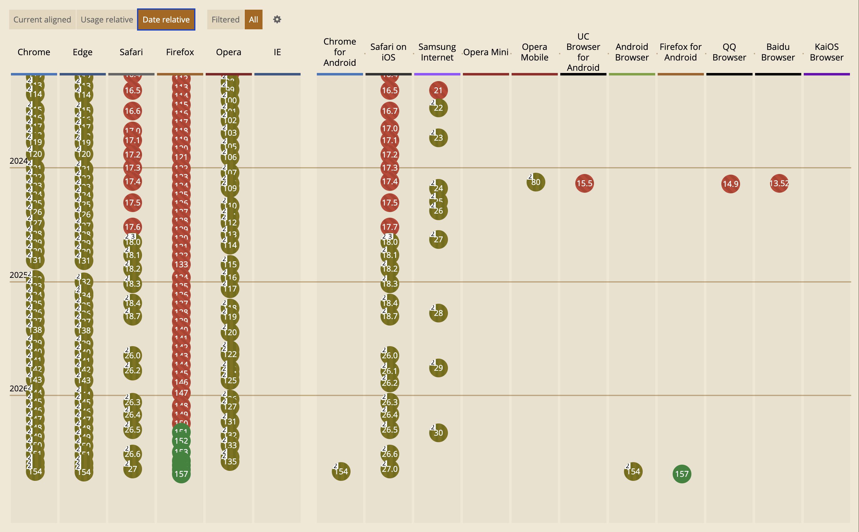
Now, let’s see the Usage relative chart:
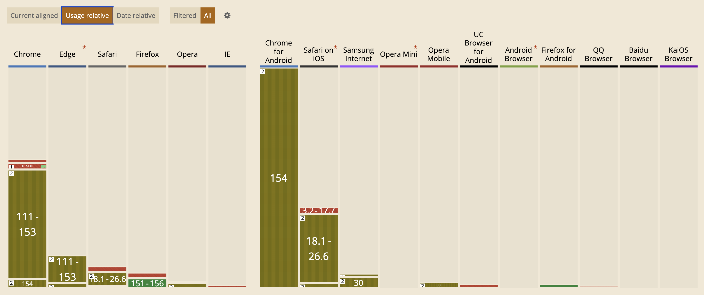
Firefox as a whole accounts for 2.28% of worldwide market share.
Now, I’m not saying ignore Firefox because of its low market share! That would be a d*ck move, comparable to making UIs inaccessible because screen reader users are a minority. Some things matter more than their raw numbers might indicate, and not excluding Firefox is essential for the Web to remain open, interoperable, and not controlled solely by large companies.
That said, for features that have shipped in every major browser, I think it’s defensible to take market share into account. Baseline tiers are a great …baseline, but no compact metric could possibly convey this kind of granularity.
Especially for something like this, where things generally still work fine without icons, it’s a plausible strategy to treat icons as a progressive enhancement and just accept not having them in the 7% of browsers that don’t support them.
For the cases where icons are crucial, (e.g. icon-only controls) we can use a class (e.g. .icon, .icon-start, .icon-end, etc), so that older browsers with no style query support still get them.
Then, how much you want to lean in to progressive enhancement depends on how widely you rely on the class vs the style query.
You could even add other known selectors to it e.g. inline styles or known selectors with icons:
.icon-start,
[style*="--icon-start:"],
button.delete {
	&::before {
		/* ... */
	}
}
Do note that unrestricted attribute selectors like that can be slow, so use them judiciously.